
Shortlist Configuration and Styling
When creating a Shortlist, Winner List or Voting List, you have many options to ensure the configuration and styling is customised to your event's style.
Remember, once you have determined your configuration and styling, you can continue to build your Shortlist, Winner List or Voting List.
There are a number of different configuration and styling options; please utilise the content table below to navigate through all options.
Each section displays options when both using and not using Advanced Options.
Options with an asterisk* (in the image) are available when you choose to enable Advanced Options.
In this article
Initial list setup
You first need to determine the shortlist type. There are 3 types of shortlist:
| Type | Content |
|---|---|
| Shortlist |
This type will include all submissions that have been identified as shortlisted in the judging round nomination view. Using this type, you can also choose to highlight the winners, which means those who have been selected as winners will be flagged as such in this list. |
| Winners | This type will include only submissions that have been identified as winner in the judging round nomination view, either by ticking the winner checkbox, or by selecting one of the pre-created winner classes. |
| Voting |
This type will include all submissions that have been identified as being part of a public vote. For more information on configuring voting, click here. |
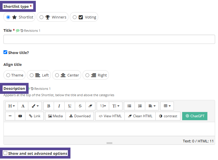
Add a title to save this shortlist as. Then, choose if you wish to show this title on your website, and if so, if the title will be aligned left, right, or centred.
Add an optional description. Then, choose if you will use advanced options for configuration and styling.
List Style
First, determine your list style. This will determine how your list will be displayed when placed on your website. There are three options; List, Tiles and Slider.
List

When you choose List, the entries that have been chosen for your list will be displayed in a vertical list.
There are no further list style configurations, so you can continue to Image configuration.
Tiles
When you choose Tiles, there are further settings to configure.
Options with an asterisk* (in the image) are available when you choose to enable Advanced Options.
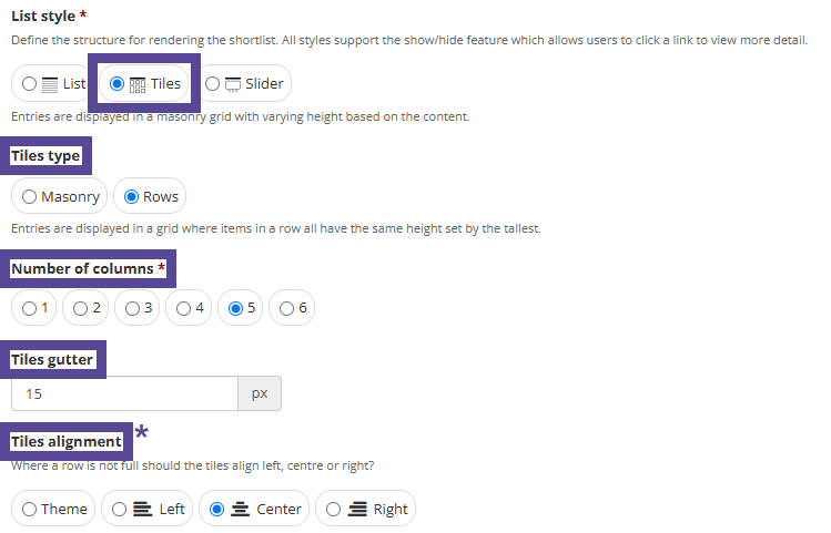
First, choose if tile type will be displayed in Masonry or Rows format. A masonry grid will display tiles with varying heights based on their content; rows all have the same height, set by the tallest tile.
Next, choose the Number of columns, i.e. how many tiles across in each row.
Then, choose the tile gutter, which refers to the spacing between each tile.
Choose the tile alignment*, which defines how tiles are shown when a row is not full.
Next, choose if you wish to Add border to tiles*. If this option is not ticked, a 1 pixel border will be applied, in the secondary colour from your Theme Settings colour palette.
If this option is ticked, you can choose the tile border width*, the tile border style*, and the tile border colour*.
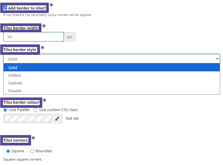
Finally, choose how you prefer your tile corners* to be displayed; you can choose between square, or rounded corners, which sets a 15 pixel radius.
Slider
When you choose Slider, there are further settings to configure.
First, choose if you wish to set the Slider Height. If you don't set a slider height, the height of the tallest item in the slider will be set. If you do choose to set the slider height, enter the value in pixels in the slider height box.
Then, set a Slider Width. This can be done by px (pixels) or % (percent). To fill your website row, it's best to set this to 100%.
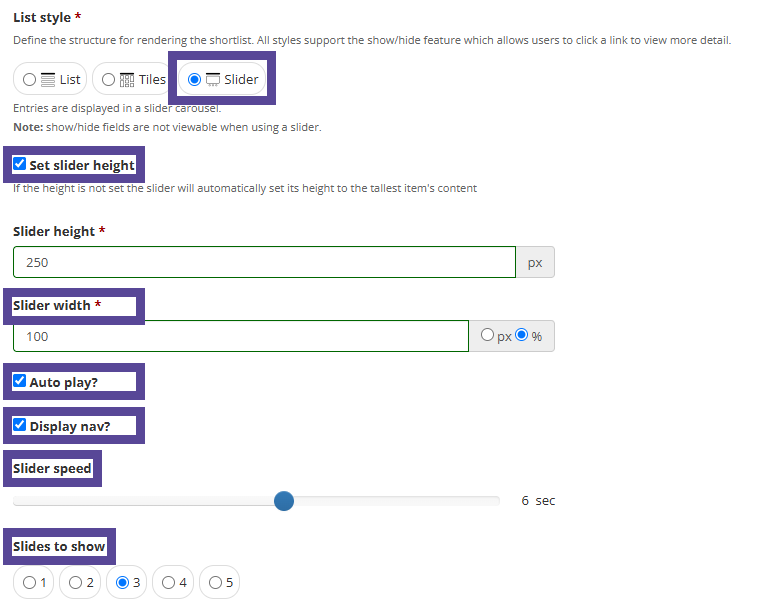
Next, choose if your slider will Auto Play. If you choose to activate this option, your slider will begin to rotate through each item on your shortlist. If you leave this option unchecked, the slider will not move until the website visitor chooses to move the slides manually.
Then, choose to display nav, which refers to the navigation arrows < > that enables the website visitor to move through the slider list.
Choose the Slider Speed , which controls how quickly your content moves through the slider.
Finally, determine how many slides will be shown at any given time. Your slider can have as many slides as desired, this option determines how many can be seen on the screen at once.
Images
You can define how images are styled on your shortlist. This is in reference to any image that appears on your list, whether uploaded to the entry form by your entrants, or added by admin during the list build.
Options with an asterisk* (in the image) are available when you choose to enable Advanced Options.
First, choose the Image Aspect. This will define how the images are displayed. There are four options.
| Original | Keeps the aspect of the images in your shortlist. If images are provided in different sizes, each image will be displayed as originally provided. |
| Landscape | Images are cropped to fit into a Landscape shape. |
| Portrait | Images are cropped to fit into a Portrait shape. |
| Square | Images are cropped to fit into a Square shape. |
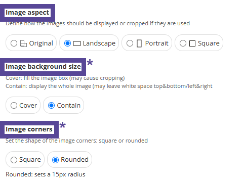
Next, determine the Image Background Size*. There are two options.
| Cover | The image will fill the box for the displayed nomination. Depending on the size of the image, this may crop the image. |
| Contain | The image will be reduced to be contained within the box for the displayed nomination. Depending on the size of the image, this may leave space above and below, or to the left and right of each image. |
Finally, define the Image Corners*, which determines if each image has square or rounded corners. Rounded corners are set to a 15px radius.
Highlighting Winners
If you are using your list to display your Shortlist (e.g. finalists), you can also choose to highlight the winners, meaning all shortlisted entries will appear, and also the entries that were classed as winners.
Note 🗒️
Be sure to click the button Refresh Shortlist nominations when selecting this option, or if nominations change.
Options with an asterisk* (in the image) are available when you choose to enable Advanced Options.
If you wish to use this option, check the box Highlight Winners?.
When checked, winners will be highlighted with a badge showing the word Winner, or the name of the winner class if you have defined these, e.g. Winner or Highly Commended.
If the winner class has an image, this will be shown..
Note 🗒️
To learn more about creating and assigning Winner Classes, click here.
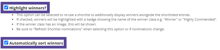
Next, choose if you wish to Automatically Sort Winners.
If you check this option, your list will be rearranged so that the Winner(s) will appear on the top of the list.
Tip 💡
If you have created multiple winner classes, the order you have arranged them in will define how the winners are sorted here.
Then, choose if you wish to Set Winner badge Style*.
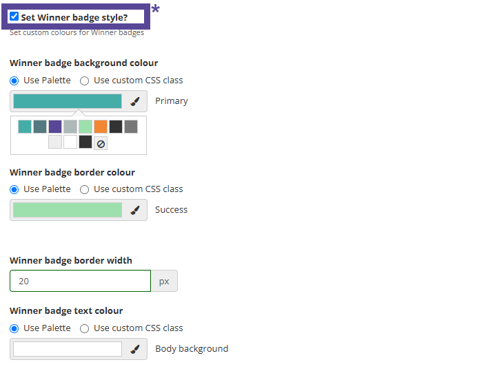
Once checked, you can edit the Winner badge background colour and Winner badge border colour.
Then, you can define the Winner badge border width, set in pixels.
Lastly, you can set the Winner badge text colour.
Category Names, Descriptions and Counts
You can further customise how your category name(s), description(s) and count(s) are displayed.
Options with an asterisk* (in the image) are available when you choose to enable Advanced Options.
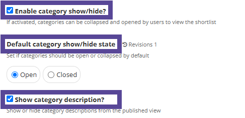
First, determine if you will Enable category show/hide. Enabling this option means that category names will be listed in their closed state, and users will need to click to view what entries are listed inside the category.
If you choose to enable this, you can also determine the Default category show/hide state, which controls if your categories are open or closed by default.
You can also choose if you will Show category description. This refers to the description of the original category that was added to your category at time of creation.
Tip 💡
If you do choose to Show category description, you can edit the description text when configuring the content of your shortlist.
Next, you can add further styling by choosing to Style category name*.
This option allows you to set font size and colour for the names of each of your categories. Once checked, you can set the font size of the category name, and the colour of the category name text, the category name background colour, and the show/hide icon and background colour
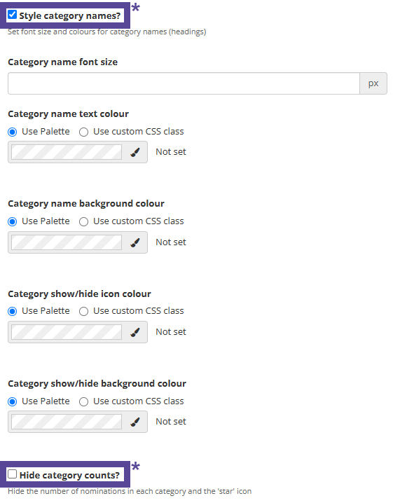
Then, you can choose to Hide category counts*. By default, each of your categories will display how many entries are listed. Check this option if you wish not to show these counts.
Next, choose your Nomination default background colour. This defines the colour background for each individual nomination.
Note 🗒️
If you have customised the styling of your winners, the winner style will override the default background colour you may set here.
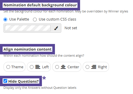
You can choose how you would like to Align nomination content. This refers to how the content from each nomination aligns within its area.
Then, you can choose to Hide Questions*.
By default, the titles of all questions you choose to add to your list will be displayed. Checking this option hides all question titles.
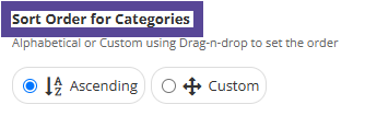
Lastly, determine how your nominations will be displayed. By default, nominations will be sorted A-Z, however you can change this to Custom, which will allow you to drag and drop your listed nominations and set your preferred order.
Nomination View by Slug*
You can choose to activate the option Enable single nomination view by slug.
Tip 💡
A slug is the last part of a URL that explains the page’s content.
If you decide to enable this, it means that each of your nominations included in the list will have their submission(s) also displayed on a unique webpage with its own URL. They can share this link with people to encourage views or votes for their submission(s).
If you do not want this functionality, please ensure you leave this option unchecked.
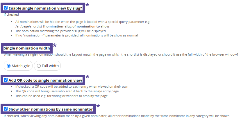
When the slug option is enabled, you can also choose to select the following options:
- Single Nomination Width*
Once you choose to enable single nomination view by slug and have Advanced Options selected you can define the single nomination width. This function allows you to control how the nomination(s) will look on their unique webpage. You can choose either Match grid (keeping the format of the list you've created) or Full Width (makes the nomination(s) take up the entire page).
- Add a QR code to single nomination view*
When enabled, each entry will have a QR code included on their individual page. These QR codes can be copied and shared to easily access the individual page and encourage interaction during the voting process.
- Show other nominations by same nominator*
When enabled, all entries made by the same nominator will appear together on their unique webpage. This is a great option to combine all of an entrant's submissions in one place.
Completing your Shortlist setup
Once you are happy with the configuration and styling of your list, please ensure you return to the setup of your Shortlist, Winners List or Voting List.